RoboBurger — Mobile PWA Ordering Experience
Role
UX/UI Designer
Timeline
2023 – 2024
Tools
Figma, FigJam
Client
RoboBurger
My Role
I was the only designer on this project, responsible for the full design process — from understanding the ordering problem to delivering a mobile PWA that connects customers to the RoboBurger machine without requiring physical kiosk interaction.
The Problem
RoboBurger is the world's first fully autonomous burger machine. To order, you had to physically walk up to the kiosk.
No order-ahead, no estimated wait time, no way to skip the queue. For a product designed around speed and convenience, the ordering experience was a bottleneck. The machine could serve a burger without a single staff member — but getting in line still required standing at the kiosk.
What Made This Hard
Designing a seamless physical-to-digital handoff
The core UX challenge was the moment between placing an order on a phone and picking it up from a physical machine. The QR code had to be designed clearly enough that users felt confident — knowing exactly when to show it, what to expect when the machine scans it, and what confirmation looks like.
Managing order state and wait time clearly
Users ordering remotely needed to know where their burger was in the process. Designing clear order states — placed, preparing, ready for pickup — without causing anxiety or confusion was a critical part of the experience.
Designing for a new and unfamiliar interaction
Most users have never ordered food through a machine via QR code. The design had to feel intuitive enough that first-time users could complete the flow without instructions, while still providing enough context to build trust in the process.
Design Decision — Making the QR Handoff Feel Trustworthy
The most important design decision in the project was how to handle the QR code screen — the moment where the phone and the physical machine meet.
The risk was uncertainty. Is my order ready? Will the machine recognize this? What do I do if it doesn't scan? Users trying something new for the first time need clear answers to those questions before they're even asked.
The solution was designing distinct states for the QR screen — order placed, burger preparing, ready for pickup — each communicating exactly where the user was in the process. When the burger was ready, the QR code became the primary focus with clear instructions on positioning. The kiosk provided on-machine guidance for the scan, so the phone UI focused on state clarity rather than repeating instructions. Together, the two touchpoints made the handoff feel seamless.
Key Screens
Order Flow
Fast, simple, matches the quick-service nature of the product
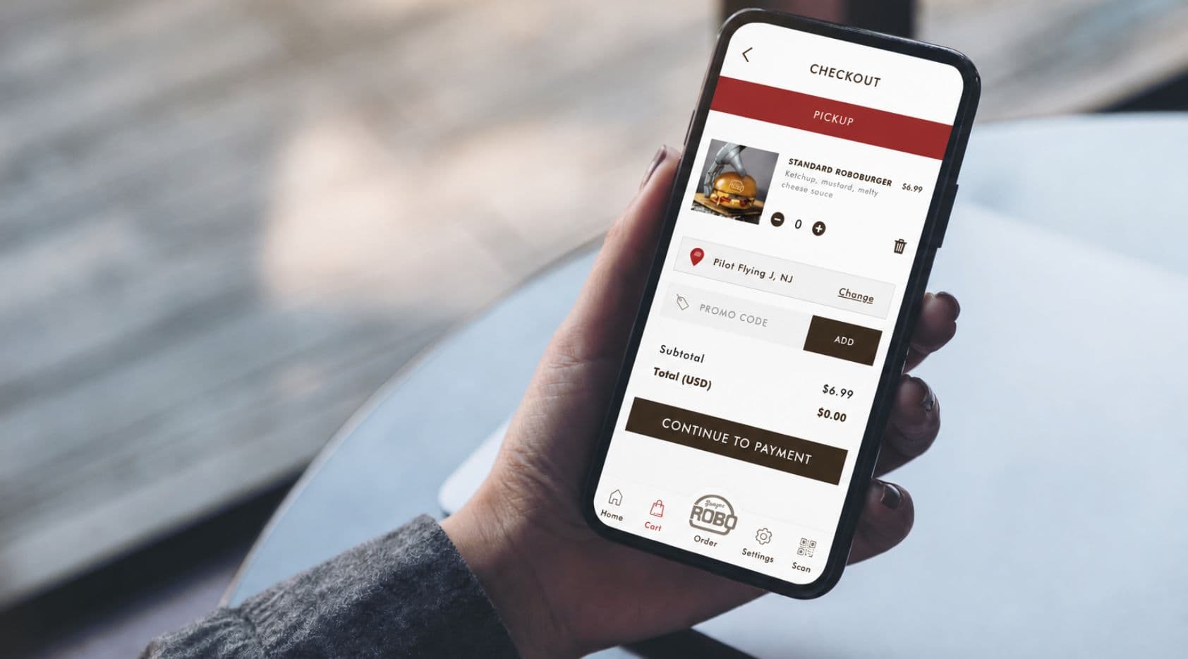
The primary ordering experience — selecting your burger, customizing it, and confirming the order. Designed to be fast and minimal, with no unnecessary steps between intent and checkout.
Order Status Screen
Real-time visibility without hovering near the machine
Shows where the order is in the process — placed, preparing, ready. Designed to reduce anxiety and keep users informed without requiring them to stand at the machine.
QR Code Screen
The moment of pickup — clear, confident, frictionless
A scannable QR code with distinct states based on order progress. When the burger is ready, the QR code becomes the primary focus with clear positioning instructions. The kiosk handles on-machine guidance; the phone focuses on clarity of state.
Outcomes
Customers can now order a RoboBurger from their phone before approaching the machine — skipping the queue, tracking their order in real time, and picking it up by scanning a QR code. The ordering experience now matches the innovation of the product itself.
Learnings
Physical-digital interactions require extra clarity
When design connects to a physical object — a machine, a scanner, a real-world location — the stakes for clarity are higher. Users can't retry easily if something feels confusing. Every state had to communicate exactly what to do next.
State design is as important as screen design
The QR code screen wasn't one screen — it was multiple states that had to feel distinct without being jarring. Getting the state transitions right was more important than the visual design of any individual frame.
Trust is built through transparency
Users trying something new need to feel like the system knows what it's doing. Clear order states, visible progress, and a confident QR screen all contributed to making first-time users feel comfortable completing the flow.
Next project
Trustabl