Microsoft-Craft75 — Microsoft Campus Gastropub Website
Role
UX/UI Designer
Timeline
2024
Tools
Figma, FigJam
Client
Microsoft & Compass Group
My Role
I was the only designer on this project, responsible for the full design process — from understanding the brand and audience to delivering a complete, live marketing website.
Craft 75 had no digital presence before this project. Everything from brand direction, visual identity, layout, and content structure was established from scratch. I worked closely with the client to make sure the website matched the quality and atmosphere of the actual dining experience.
The Problem
Craft 75 is a premium gastropub on Microsoft's Redmond campus — a nod to 1975, the year Microsoft was founded. It had no website.
Employees had no way to check menus, discover upcoming events, make reservations, or order online without physically visiting the location. A restaurant of this quality needed a proper digital home.
What Made This Hard
Building a brand identity from zero
With no existing website and no established digital direction, everything had to be defined from scratch — the tone, typography, color palette, and visual style. The design had to feel premium and welcoming without being overly corporate, matching the relaxed atmosphere of a gastropub while still feeling on-brand for a Microsoft campus venue.
Serving multiple user intents in one experience
Visitors came to the website for different reasons — checking the menu, booking a table, finding event details, ordering online. Designing a clear, simple navigation that served all these intents without feeling cluttered was a key challenge.
Balancing brand and usability
A restaurant website is as much about feel as it is about function. The design had to evoke the atmosphere of the space — the food, the drinks, the vibe — while still being easy to use for a quick lunch decision during a busy workday.
Design Decision — Establishing Brand Direction First
Before designing any screen, the first priority was establishing the visual identity. A restaurant without a digital presence has no design system to reference — so the typography, color palette, and photography style had to be defined before layout decisions could be made.
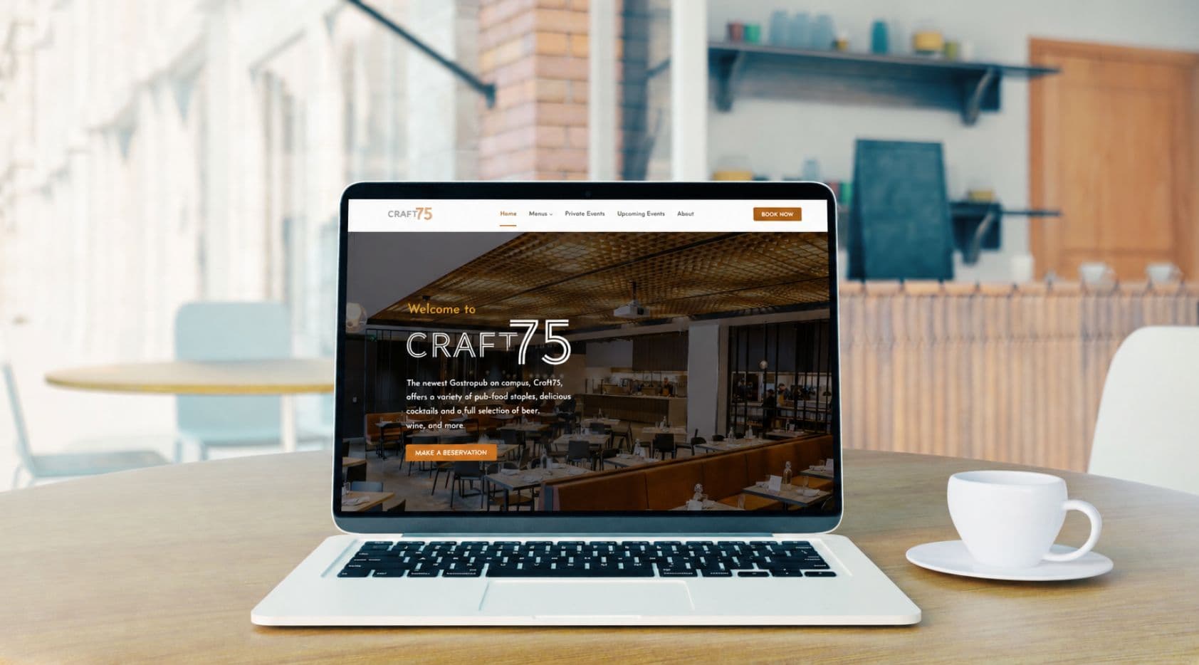
The direction taken was warm and approachable: rich tones, bold food photography, and clean typography that felt premium without being stiff. This set the tone for every page that followed and ensured consistency across the full site.
Key Screens
Homepage
Strong first impression, clear paths to the most common actions
The entry point communicating the atmosphere, the food, and the experience at a glance. Directs visitors to the most common actions: view the menu, make a reservation, or explore events.
Outcomes
Craft 75 now has a live digital presence that employees can use to browse menus, make reservations, check upcoming events, and order online. The website reflects the quality of the dining experience and gives the brand a proper home outside of the physical space.
Learnings
Starting from zero requires extra alignment upfront
With no existing design direction to reference, getting alignment on brand and visual tone early saved significant rework later. Presenting mood boards and style directions before touching layout was the right call.
Restaurant websites are as much about feeling as function
The goal was never just to display information — it was to make someone want to visit. Every design decision, from photography choices to button styles, contributed to whether the site felt inviting or flat.
Simplicity wins for high-traffic, quick-decision users
Microsoft employees checking the menu during a short break need information fast. Prioritizing clarity and speed of access over visual complexity made the experience more useful in real conditions.
Next project
Microsoft-CALM