Carbonetes — Comprehensive Container Security Platform
Role
UX/UI Designer
Timeline
2022 – 2025
Tools
Figma, FigJam, Jira
Client
Carbonetes
My Role
I was the only designer on this project across both the web application and the marketing website, responsible for the full design process — from research and user flows to prototyping and handoff.
My work covered two distinct but connected deliverables: designing the product itself and designing the marketing website that communicates the product's value to potential customers. Both required a deep understanding of the developer and security-focused audience.
The Problem
Developers and security teams had to run each scanner separately — one at a time, with no unified view.
Carbonetes provides container security scanning: checking for vulnerabilities, licenses, secrets, software dependencies, and infrastructure issues. But the fragmentation meant slower workflows, higher risk of missed issues, and no clear way to prioritize what to fix first. The question the product needed to answer: what does my container actually look like from a security standpoint, right now, all at once?
What Made This Hard
Combining five scan types without overwhelming the user
Vulnerabilities, licenses, secrets, dependencies, and infrastructure issues are five completely different types of findings. Each has its own data, severity logic, and fix path. Designing a unified report that surfaced all five without turning the screen into an unreadable wall of data was the central design challenge.
Designing for a technical audience with high expectations
The target users are developers and security engineers — experienced, detail-oriented, and intolerant of vague or imprecise information. Every finding had to feel specific, actionable, and credible. Generic summaries or unclear severity labels would break trust immediately.
Translating complex security concepts for the marketing website
The marketing website needed to communicate what Carbonetes does to an audience ranging from deeply technical to business-level decision makers. Designing for both without oversimplifying for one or overwhelming the other required careful structure and clear language.
Design Decision — Severity as the Primary Organizing Principle
Before designing any screen, the core question was: how do you surface five types of findings across potentially hundreds of issues without losing the user?
The answer was severity. Rather than organizing findings by scan type — showing all vulnerabilities, then all license issues, then all secrets — the decision was to surface everything through a single severity lens: Critical, High, Medium, Low.
This meant a developer opening the comprehensive scan report could immediately see what needed attention today versus what could wait. The scan type became a filter, not the primary structure. This made the report faster to act on and easier to trust — because the most important things were always visible first.
Key Screens
Comprehensive Scan Dashboard
The unified view of all scan results, organized by severity
All findings from five scan types in one place, organized by severity so users can prioritize immediately without digging through separate tools.
Findings Detail View
Enough context to act confidently without leaving the platform
The drill-down experience for individual findings — exactly what was found, why it matters, its severity level, and what to do about it. Designed for developers who need precise information, not summaries.
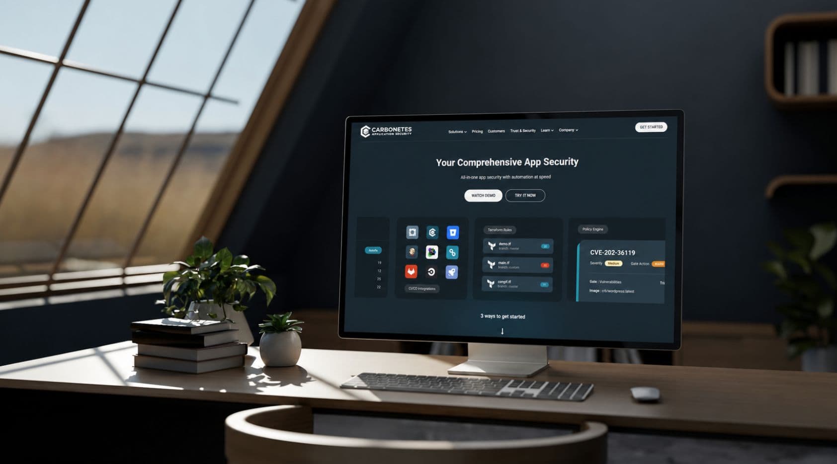
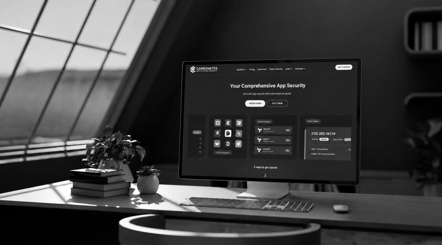
Marketing Website
Clear and credible for a technical audience
A public-facing website communicating Carbonetes' value to developers and security teams. Designed to be specific enough for engineers while remaining accessible to business stakeholders evaluating the product.
Outcomes
Developers and security teams can now run a single comprehensive scan and receive one unified report organized by severity. What previously required multiple separate tool runs is now a single pass — faster, more complete, and easier to act on. The marketing website gives Carbonetes a clear digital presence that communicates the product's breadth and credibility to the right audience.
Learnings
Severity-first design reduces decision fatigue
When users face hundreds of findings across multiple categories, the most useful thing design can do is tell them what matters most right now. Organizing by severity rather than by scan type made the report immediately actionable rather than overwhelming.
Technical audiences reward specificity
Vague labels and generic descriptions break trust fast with developer users. Every finding label, severity definition, and remediation suggestion had to be precise. The more specific the information, the more credible the product felt.
Designing a product and its marketing site in parallel creates consistency
Working on both the web app and the marketing website at the same time meant the language, tone, and visual direction stayed aligned. What the product delivered matched what the website promised — and that consistency builds credibility from first visit to daily use.
Next project
Microsoft-Craft75